
November 4, 2026
Workwear Logo Placement Guide for Your Team
A logo can be perfectly printed and still miss the mark if it is in the wrong place. Put it too low on a shirt and it disappears under a jacket. Put it on a high-wear area and it may fade or crack sooner than expected. This workwear logo placement guide helps your company choose locations that look professional, hold up on the job, and make sense for how your employees actually wear their gear.
For businesses across Salt Lake City and the Wasatch Front, branded workwear often has to do more than identify the team. It may need to meet safety requirements, layer over other clothing, work around tools or name badges, and remain recognizable from across a jobsite or event floor. Placement should follow the job, not just a design mockup.
Start With the Job and Garment
Before choosing a logo location, consider the work your employees do and the garment they will wear most often. A polo worn by office staff has different needs than a high-visibility jacket used by a field crew. A restaurant apron, warehouse hoodie, and construction vest all create different practical limits.
Ask a few basic questions early: Will employees wear jackets over the shirt? Do they carry radios, clipboards, or tools on the chest? Are name badges required? Will the garment be washed frequently or exposed to abrasion? These details keep your company from ordering a placement that looks good in a proof but performs poorly in the field.
The decoration method matters too. Embroidery gives polos, jackets, hats, and heavier work shirts a clean, durable finish. Screen printing is often the most economical choice for larger quantities and bold designs. DTF works well for detailed, full-color artwork on many garment types, while DTG is a strong option for highly detailed artwork on compatible cotton garments. Our team can recommend a method after we see the logo, garment, quantity, and intended use.
Workwear Logo Placement Guide: The Main Options
Left chest: the everyday standard
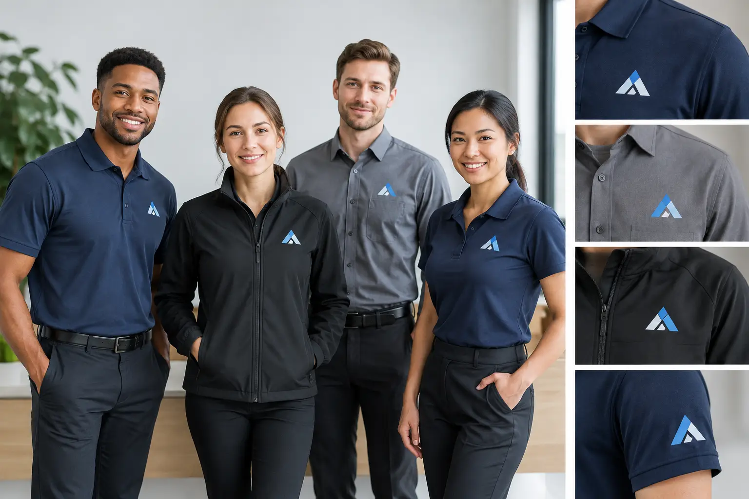
The left chest is the most common placement for company workwear, and for good reason. It is visible in conversation, looks established, and works on polos, button-downs, jackets, quarter-zips, work shirts, and many safety garments. For most teams, this is the safest starting point.
A left-chest logo is usually kept fairly compact so it sits cleanly above the pocket area or on the upper chest. It is especially effective for embroidered logos with a business name, simple icon, or short tagline. If your logo has small text or fine detail, enlarging it slightly or simplifying the artwork may be necessary for embroidery.
The trade-off is distance visibility. A left-chest logo identifies an employee up close, but it will not do much for recognition from a parking lot, jobsite, or crowded event. That is where a back print or secondary placement can help.
Full back: built for visibility
A full-back logo is the best choice when people need to recognize your crew from a distance. Contractors, delivery teams, maintenance staff, event volunteers, school groups, and outdoor crews often benefit from a larger back design. It gives your company name, logo, phone number, or service line room to be read quickly.
For many workwear programs, the strongest combination is a small left-chest logo with a larger back print. The front looks professional in meetings and customer interactions, while the back handles visibility on the move.
Keep the back artwork focused. A large logo and company name usually work better than a crowded design packed with every service, social handle, and slogan. If employees wear a jacket, the back print should be on the outer layer rather than only on the shirt underneath.
Center chest: bold, but not always practical
A center-chest logo has a casual, modern look and gives wide artwork more room than a left chest. It works well on T-shirts, hoodies, and event apparel, particularly when the goal is a clear, bold team identity.
For daily uniforms, center chest is not always the best answer. It can conflict with safety harnesses, lanyards, radios, and outerwear. It may also be less appropriate for companies that want a traditional uniform appearance. If your staff works in an office, retail setting, or customer-facing service role, left chest is usually the more versatile choice.
Sleeve placement: useful support, not usually the primary logo
Sleeves can carry a secondary logo, flag, department name, event sponsor, or short message. A sleeve mark is a good way to add identity without competing with the main front or back design. It is common on long-sleeve work shirts, jackets, and performance apparel.
This placement has limits. Sleeves are narrow, curved, and subject to movement, so tiny text can be hard to read. A simple icon, short word, or recognizable mark tends to work best. Consider the employee's work too. On crews where sleeves rub against equipment or surfaces, a sleeve decoration may experience more wear than a chest or back print.
Right chest: names and secondary information
The right chest is often reserved for employee names, job titles, certifications, or a small secondary mark. This creates a balanced uniform when your main company logo sits on the left chest. For service teams, adding first names can make customer interactions friendlier and help clients identify who is on site.
Names are usually embroidered on polos, button-downs, jackets, and work shirts. If your company has frequent staff changes, there is a cost and inventory consideration. Personalized garments are harder to reassign, so some companies use standardized uniforms for most staff and reserve named items for customer-facing employees or management.
Plan Around Pockets, Seams, and Layers
A garment is not a flat billboard. Pockets, zippers, buttons, reflective tape, seams, and panels all affect placement. A logo that crosses a zipper or lands partly on a pocket may look uneven and may not decorate cleanly. This is particularly common with performance polos, work jackets, and high-visibility apparel.
If your company needs safety clothing, avoid placing decoration where it reduces the effectiveness of reflective striping or creates confusion around required markings. Some garments also have fabric coatings or stretch panels that require a specific decoration approach. Bring these details up during quoting, especially if your team supplies its own garments.
Layering deserves attention as well. A branded T-shirt under an unbranded jacket may not provide the visibility your company expects during colder months in Utah. For a field team in South Jordan, Sandy, or Park City, it can make more sense to brand both warm-weather shirts and outerwear, using consistent logo locations across the program.
Size the Logo for Reading, Not Just Appearance
The right logo size depends on the placement and viewing distance. A small chest mark should be readable at conversational distance. A back print should be readable several steps away. Bigger is not automatically better, though. An oversized front logo can overwhelm a polo, while a large, detailed back design may become difficult to read if the elements are too close together.
When a logo includes fine lines, gradients, tiny type, or multiple colors, it may need adjustment for the selected decoration method. Screen printing can reproduce bold, clean graphics very well and allows Pantone color matching. Embroidery uses thread colors and needs enough space for details to stitch clearly. DTF and DTG can preserve detailed, full-color artwork, but garment fabric and use conditions still matter.
A good proof should show the logo at its actual size on the selected garment. Do not approve based only on a large artwork file. Ask whether the smallest text will remain legible and whether the placement will clear pockets, seams, and closures.
Choose a Consistent System for Your Team
Consistency is what makes workwear look organized. If one employee has a logo centered on the chest, another has it over a pocket, and jackets use a completely different scale, the program can feel improvised. That may be acceptable for a one-time volunteer event, but it is rarely the best choice for ongoing employee uniforms.
Set a simple standard for your company. For example, use left chest on polos and jackets, a full back print on field shirts, and an optional name on the right chest. The exact system depends on the role, but repeating the same logic across garments makes reorders easier and helps employees look like one team.
At Affordable-Printing, we help business buyers compare garment options, placement choices, and decoration methods before production. We can work from your existing artwork or help prepare it, with screen printing, embroidery, DTF, and DTG available for orders of 12 pieces or more. Standard turnaround is 12 business days from artwork approval, and rush timing can be discussed when your corporate event or uniform deadline is tight.
The best placement is the one your employees can wear comfortably, your customers can recognize quickly, and your company can repeat with confidence. For a free quote on branded workwear for your team, call Affordable-Printing at (801) 260-0606 or visit affordable-printing.com/request-a-quote/.
Ready to start your order?
GET A FREE QUOTE