_1782777776334-CjnZ693B.png)
May 10, 2026
Best Logo Placement on Shirts
A logo can be perfectly designed and still fall flat once it hits the shirt. Most problems are not about the artwork itself. They come from poor logo placement on shirts - too high, too low, too large, too small, or simply in the wrong spot for the job the shirt is supposed to do.
For businesses, schools, nonprofits, and event teams, placement affects more than looks. It changes visibility, wearability, and cost. A shirt for staff identification needs different placement than a fundraiser tee, a company uniform, or a sponsor-heavy event shirt. Getting that decision right early helps avoid production delays, design revisions, and shirts that never get worn again.
Why logo placement on shirts matters
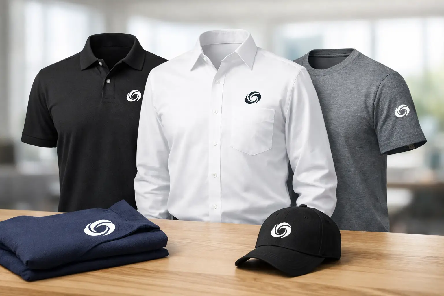
Placement controls what people notice first. A left chest logo gives a clean, professional look and works well for uniforms, polos, and employee apparel. A full front print is more promotional and better for messaging, campaigns, and event visibility. A back print can carry larger branding, team names, or sponsor artwork without crowding the front.
It also affects how natural the shirt feels to wear. Some designs look balanced on a proof but feel awkward on the body once printed. A large graphic that sits too high can feel heavy near the collar. A chest logo that drifts too far toward the center can look off-brand or cheap. The goal is not just to fit the art on the shirt. The goal is to make the shirt useful and wearable.
That is especially important when you are ordering for a group. If people are expected to wear the shirts at work, at school functions, on volunteer days, or at public events, comfort and appearance both matter. Good placement helps the item do its job longer.
The most common shirt logo placements
There is no single best location for every order, but a few placements cover most business and event needs.
Left chest
The left chest is one of the most common options because it is simple, professional, and easy to pair with different shirt styles. It works especially well for company uniforms, staff shirts, school apparel, and polos. Embroidery is often used here, but screen printing, DTF, and DTG can also make sense depending on the artwork and garment.
This placement is usually best for logos that are compact and readable at a smaller size. If your logo depends on fine detail, small text, or a long horizontal layout, the left chest may not be the best fit unless the artwork is adjusted.
Full front
A full front print is built for visibility. It is often the best choice when the shirt is meant to promote an event, carry a campaign message, or create stronger brand recognition from a distance. This placement gives more space for bold graphics, taglines, and larger designs.
The trade-off is that a full front design is less subtle. For employee uniforms or more formal branded apparel, it can feel too aggressive. It can also affect pricing depending on print size, number of colors, and decoration method.
Center chest
Center chest placement sits between left chest and full front in both size and visual impact. It is popular for team shirts, retail-style branding, and simple logo treatments that need more presence than a small chest mark.
This option works best when the logo has a clean shape and enough contrast to stand out without taking over the entire shirt. If the design includes a lot of supporting text, it may still need a larger full front layout.
Full back
A full back print is common for event staff, contractors, volunteer groups, and organizations that need branding seen from across a room or parking lot. Many buyers pair a small front logo with a larger back design. That combination gives the shirt a professional front and a stronger promotional surface on the back.
Back prints are also useful when multiple sponsors, department names, or event titles need to be included. The extra space helps keep the design readable.
Sleeve and other secondary placements
Sleeve prints, upper back neck prints, and right chest placements are usually secondary additions. They can be effective, but only when there is a clear reason for them. A sleeve logo can add polish to branded apparel. A back neck print can support retail-style branding. A right chest mark may work when the left chest is reserved for a name or title.
These placements are rarely the first decision. They usually make sense after the main branding area is already set.
Choosing placement based on the shirt's purpose
The right placement depends on what the shirt needs to accomplish.
If the shirt is for employee wear, left chest is often the safest choice. It looks established, keeps the branding clean, and works well across polos, tees, and outerwear. If you want stronger brand exposure while employees are out in the field, pairing a left chest logo with a full back print can be more effective.
If the shirt is for an event, think about distance. Will people need to identify staff, sponsors, or participants quickly? Larger front or back graphics usually perform better. If it is a fundraising shirt or giveaway item, wearability matters just as much as visibility. A shirt that looks too much like an ad may not get reused.
For schools, teams, and community groups, the answer often depends on whether the shirt is more about identity or promotion. Team shirts usually benefit from larger graphics, while staff or faculty apparel often needs a cleaner chest placement.
Decoration method changes what works
Placement decisions should also match the print method. This is where many orders go off track.
Embroidery is ideal for smaller placements like left chest, hats, and some sleeve applications. It gives a durable, elevated look, but it is not always the best option for large graphics or logos with very fine detail.
Screen printing works well for front and back designs, especially when you need strong color, good durability, and solid value on larger runs. It is a practical choice for event shirts, business apparel, school programs, and promotional orders.
DTG and DTF are useful when artwork is more detailed, includes gradients, or needs more color flexibility. Depending on the garment and design, these methods can handle placements that would be difficult to reproduce cleanly with other processes.
The point is simple: not every logo should go in every location just because it fits on the mockup. The print method, garment type, and artwork all need to agree.
Common mistakes with logo placement on shirts
One of the biggest mistakes is scaling the logo without thinking about reading distance. A logo that looks fine on a computer screen may be too small to identify in person. Another common problem is trying to force a detailed logo into a left chest position when the art needs more room.
Shirt style matters too. Placement on a standard cotton tee is different from placement on a polo, hoodie, or performance shirt. Seams, plackets, pockets, and fabric stretch all affect how the final result looks.
There is also the issue of audience preference. Internal staff apparel usually needs restraint. Promotional giveaway shirts often need more visual impact. If you use the same placement strategy for both, one of them may miss the mark.
Finally, too many print areas can dilute the design and push the budget in the wrong direction. More decoration is not always better. In many cases, one strong placement or one balanced front-and-back combination does more for the brand.
How to decide before you place the order
Start with three questions: who is wearing the shirt, where will they wear it, and what should people notice first? Those answers usually narrow the options quickly.
If your priority is a professional branded look, lean toward left chest or a refined center chest treatment. If your priority is event visibility, a larger front or back placement will usually perform better. If your design includes multiple elements, consider separating them instead of crowding one print area.
It also helps to think in terms of use life. A shirt meant for one-day event exposure can be more promotional. A shirt meant for repeated staff wear should be cleaner and easier to live in. That difference matters.
For buyers managing apparel across multiple departments or campaigns, consistency is worth protecting. Standardizing placement for uniforms, event shirts, and team apparel makes future reorders easier and helps the brand stay recognizable. Affordable-Printing often sees the best results when customers choose placements based on function first, then refine the artwork to fit the garment instead of forcing the opposite approach.
A good shirt does not just carry a logo. It puts that logo where people will actually see it, where the wearer feels comfortable, and where the design still makes sense after the event is over. That is usually the difference between apparel that gets used once and apparel that keeps working for your brand.
Ready to start your order?
GET A FREE QUOTE