
July 22, 2026
How to Match Brand Colors on Custom Apparel
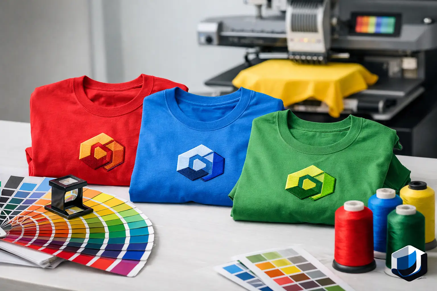
A navy logo that looks right on a website can turn purple on a red shirt. A bright corporate green can look muted in embroidery. Those are the kinds of problems business buyers run into when figuring out how to match brand colors for uniforms, event shirts, employee gifts, and promotional products.
For companies across Salt Lake City and the Wasatch Front, consistent color is more than a design detail. It helps employees look like one team, makes event materials recognizable, and keeps your company from appearing to use a different logo every time it orders apparel. The good news is that color matching is manageable when you start with the right files and choose decoration methods with realistic expectations.
Start With Your Official Brand Color References
The best starting point is your company’s brand guide. If your marketing department, designer, or franchisor has provided Pantone, CMYK, RGB, and HEX color values, send them with your artwork. Each value serves a different purpose, and they are not interchangeable.
Pantone colors are the most useful reference for screen printing because they identify a specific ink target. When a company needs a printed logo to match its established identity as closely as possible, a Pantone number gives the production team a clear standard to work from. This is especially helpful for repeat orders, multi-location companies, and corporate events where shirts, bags, drinkware, and signage need to feel coordinated.
CMYK values are used for full-color print design, while RGB and HEX values are built for screens. A logo shown on a monitor is made from light. A logo printed on cotton, polyester, paper, or a stainless drinkware item is made from ink, thread, or another physical material. The values can guide the process, but they cannot guarantee an identical result across every surface.
If your company does not have a brand guide, send the cleanest version of the logo available. A vector file such as AI, EPS, PDF, or SVG is ideal. A high-resolution PNG can also work for some projects. Avoid taking a screenshot from your website or sending a small image pulled from email. Those files often shift color, blur at print size, and make accurate matching harder than it needs to be.
How to Match Brand Colors Across Decoration Methods
The decoration method matters as much as the color file. Screen printing, embroidery, DTF, and DTG all handle color differently. The right choice depends on your logo, garment, quantity, budget, and how exact the match needs to be.
Screen Printing Gives the Most Control for Solid Colors
For polos, T-shirts, hoodies, team apparel, and event merchandise with solid logo colors, screen printing is usually the strongest option for color control. Ink can be mixed to target a Pantone color, then printed directly onto the garment. For many company uniforms and large event orders, this produces clean, repeatable results at a practical cost.
Fabric color still affects the outcome. The same yellow ink printed on white, gray, and black shirts will not look exactly the same. On dark garments, a white underbase may be printed first so the logo color stays bright. That step improves visibility, but it can slightly affect the final appearance and feel of the print.
If your brand relies on a very specific color, tell the team which shade matters most. A deep blue, for example, may need to stay close to the Pantone reference even if the garment material creates a slight visual difference. Approving a digital proof before production helps catch obvious issues, though a digital screen is not a physical ink sample.
Embroidery Uses Thread, Not Ink
Embroidery creates a durable, professional look for company polos, jackets, hats, workwear, and bags. It does not use Pantone ink. Instead, the logo is built with available thread colors that are selected to closely match your brand standards.
Thread has a sheen that ink does not. Under office lights, outdoor sunlight, or event lighting, it can reflect differently than a flat printed logo. Small details also matter. Thin lines, tiny type, subtle gradients, and closely spaced colors may need to be simplified so the stitched logo remains readable.
For an embroidered logo, close matching is often the right goal rather than a claim of perfect Pantone duplication. Our team can match thread colors to your artwork and recommend adjustments when a design will stitch better with a slightly different shade or a simplified detail.
DTF and DTG Work Well for Full-Color Art
DTF and DTG are useful when your artwork includes gradients, photos, detailed illustrations, or many colors that would be expensive or impractical to screen print. DTF transfers are applied to the garment, while DTG prints the artwork directly into the fabric. Both can produce strong full-color graphics for employee apparel, campaign shirts, school groups, and event merchandise.
These methods use a digital color process, so color is influenced by the artwork file, printer settings, garment color, and material. They can reproduce complex artwork very well, but a single digital color should not be assumed to match a mixed Pantone screen-print ink exactly. If a project includes both screen-printed work shirts and DTF event shirts, plan for a close visual match rather than an identical one.
Choose the Garment Before Finalizing the Color Plan
A brand color does not exist in isolation. It sits next to the shirt, jacket, cap, tote, or promotional item you choose. A dark logo may disappear on a black garment. A white logo may lose contrast on athletic heather gray. A subtle embroidered mark may look excellent on a khaki cap but get lost on a busy camouflage pattern.
For your company’s everyday uniforms, the safest approach is often to choose one or two garment colors that give your logo strong contrast. White, black, navy, charcoal, and heather gray are common because they work with many brand palettes and are easier to reorder later. That does not mean every company needs neutral apparel. A construction crew, school team, nonprofit fundraiser, or corporate event may benefit from a brighter garment color when visibility is part of the goal.
Before approving a large order, think about where the item will be used. Indoor office polos, outdoor staff shirts, tournament tees, and trade show giveaways have different visibility needs. A color that looks polished in a conference room may not stand out in a crowded Park City event venue or on a sunny field in Draper.
Keep Repeat Orders Consistent
The first order is the best time to establish a clear record. Save the approved artwork, Pantone references, garment style and color, decoration method, logo size, and placement. If your organization has separate divisions, include notes about which logo version belongs on each item. That record prevents the common problem of ordering “the same thing as last time” when last time’s details are not available.
Consistency becomes especially valuable for companies that order in stages. Your team may need 24 embroidered jackets for managers this month, 60 screen-printed shirts for field employees next quarter, and branded drinkware for a year-end event. The items will not all use the same decoration process, but they should use the same approved logo files and color priorities.
At Affordable-Printing, we help businesses and organizations organize those details before production. We offer Pantone color matching for screen printing and thread matching for embroidery, along with DTF and DTG options when the artwork calls for full-color printing. Our standard turnaround is 12 business days from artwork approval, and we can discuss rush timing when your corporate event or team deadline is closer.
Know When “Close” Is the Practical Answer
Some brand colors are easy to reproduce. Others are not. Metallic shades, neon colors, very bright fluorescents, subtle gradients, and colors printed on dark or textured materials all involve trade-offs. A logo may need a different thread choice for a hat than it uses in screen print on a shirt. A drinkware imprint may require a simplified one-color version. That is normal production planning, not a sign that your brand is being compromised.
The key is to identify what cannot change. Is the exact blue critical? Does the logo need to remain legible from a distance? Is the company ordering several products for one event? When your priorities are clear, the production team can recommend the method and materials that deliver the best result within your budget.
If your Salt Lake City-area company is planning branded apparel or promotional products, send your logo and any Pantone references early. For a free quote and practical color-matching guidance for your team, call Affordable-Printing at (801) 260-0606.
Ready to start your order?
GET A FREE QUOTE