_1782777776334-CjnZ693B.png)
June 13, 2026
9 Restaurant Uniform Embroidery Ideas
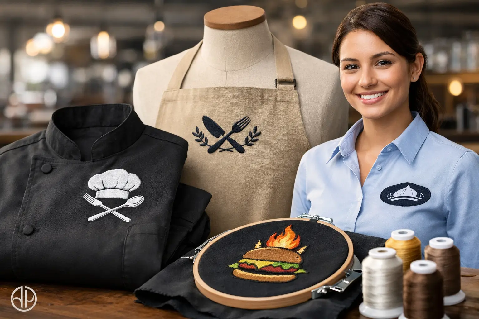
A server walks up to the table, and before a word is said, the uniform already tells your customer something about the restaurant. Clean stitching, readable names, and a logo in the right spot make your team look organized. That is why restaurant uniform embroidery ideas matter - not as decoration, but as part of how your brand shows up on the floor every day.
For restaurant groups and independent operators across Salt Lake City and the Wasatch Front, embroidered uniforms are usually a smart fit for front-of-house apparel, manager polos, host stands, and outerwear. Embroidery holds up well, looks established, and gives your team a more permanent, polished look than a temporary printed solution. The right design, though, depends on the garment, the job role, and how formal or casual your restaurant brand is.
What makes restaurant embroidery work
Good embroidery is simple enough to read at a glance and durable enough to survive repeated washing. That sounds obvious, but a lot of uniform designs get overloaded. A logo that looks great on a menu or website can become hard to stitch if it has tiny text, thin outlines, or too many color changes.
For uniforms, the goal is usually not to reproduce every detail. It is to create a clean stitched version that still feels like your brand. In many cases, that means simplifying the artwork, enlarging small elements, or choosing one placement that gets seen most often instead of decorating every possible area.
There is also a practical side. Embroidery works especially well on polos, button-downs, aprons, jackets, quarter-zips, hats, and heavier woven garments. On very lightweight or stretchy pieces, it can still work, but it depends on the material and the stitch count. For some uniforms, a mix of decoration methods makes more sense, such as embroidery on polos and DTF or screen printing on back-of-house tees.
1. Left chest logo embroidery
This is still the standard for a reason. A left chest logo looks professional, feels balanced on most garments, and works across polos, button-downs, jackets, and aprons with bib panels. If your team includes managers, hosts, servers, and sales staff for catering, this placement creates consistency without making the uniform feel too promotional.
It is also one of the safest choices for logos with moderate detail. The area is large enough for a recognizable mark but small enough to stay clean. If your restaurant has a refined brand, this is usually the first place to start.
2. Employee name on the opposite chest
Adding employee names on the right chest is one of the most useful restaurant uniform embroidery ideas if customer interaction matters. It helps with hospitality, speeds up introductions, and makes service feel more personal. For full-service restaurants, cafes, hotels, and private dining teams, this can be more valuable than people expect.
The trade-off is cost and complexity. Individual names mean variable data, and that adds setup and production steps. It is often worth it for front-of-house uniforms, but less necessary for back-of-house roles where customer visibility is limited.
3. Job title under the name or logo
Role identification can be helpful in larger operations. If your restaurant has banquet staff, catering teams, floor managers, bartenders, and event supervisors, a small title under the employee name can cut down on confusion. It is especially useful for hospitality groups, venues, and restaurants that host private events.
This only works if the text stays short. "Manager," "Bartender," or "Chef" is fine. A longer department name usually looks crowded and becomes harder to read after stitching. In those cases, color-coding garments by role may work better than adding more text.
4. Apron embroidery centered on the bib
For aprons, centered bib embroidery gives your brand high visibility without overcomplicating the shirt underneath. This is a strong option for coffee shops, bakeries, breweries, quick-service counters, and open-kitchen concepts where the apron is the main visual uniform piece.
The logo should usually be a bit bolder here than on a left chest polo. Fine text may get lost at normal customer distance. If your team moves fast and works in lower light, clean shapes and strong contrast matter more than design detail.
5. Sleeve embroidery for a secondary brand element
Sleeve embroidery is a good choice when you want a subtle branded touch without crowding the front of the garment. This works well for a small icon, monogram, or abbreviated brand mark. It is often used on chef coats, manager polos, and outerwear.
This placement is more understated, so it is rarely the only embroidery location. Think of it as support for the main logo, not a replacement. If your front logo already includes too much text, moving a secondary element to the sleeve can keep the overall look cleaner.
6. Chef coat embroidery with name and title
For kitchens with visible chef coats, embroidery can reinforce professionalism fast. A chef name on one side and a restaurant logo on the other is a classic setup because it feels established and functional. It also helps when your chef team interacts with guests, works expo, or appears in event photos.
White and black coats both work well, but thread choice matters. Tonal embroidery can look sharp and upscale, while high-contrast thread makes names easier to read. The right option depends on whether your brand leans more fine dining or fast casual.
7. Hat embroidery for high-visibility roles
If your team wears caps or visors, embroidery is often the best decoration method. Hats take heavy wear, and stitched logos tend to hold up better over time than many printed alternatives. For fast casual concepts, food trucks, patios, and kitchen teams, hats can carry more branding than the shirt itself.
Keep the design simple. Hat embroidery has less room for detail, especially on structured caps. A short wordmark, icon, or initials usually performs better than a full logo lockup with slogan text.
8. Tonal embroidery for a more upscale look
Not every restaurant uniform needs high-contrast branding. If your concept is more refined, tonal embroidery can make a strong impression without looking loud. Think black thread on a black button-down, navy on navy for manager quarter-zips, or a subtle gray-on-charcoal treatment for front-of-house outerwear.
This style works best when the brand is already recognized in the space or when the overall presentation is polished. The downside is readability. If immediate logo visibility matters more than subtlety, a contrast thread color may be the better business choice.
9. Department-based color or placement systems
One of the more practical restaurant uniform embroidery ideas is not about the logo itself, but how embroidery helps organize departments. Hosts might wear one color polo with left chest embroidery, managers another, and catering staff a button-down with names added. The branding stays consistent while the uniform system becomes easier to manage.
This is useful for multi-unit restaurants, event venues, and larger teams with shift changes. It helps customers identify staff and gives operations managers a cleaner way to assign apparel by role. When you are ordering for your company, that kind of clarity matters just as much as the design.
How to choose the right embroidery setup for your team
Start with the job, not the garment
A common mistake is choosing a shirt first and trying to force every role into it. Hosts, servers, kitchen staff, and managers do not all need the same apparel. Start with how each team member works, then choose the garment and embroidery placement that fits the role.
For example, front-of-house polos with left chest logos may be right for daily service, while kitchen tees might be better with DTF or screen printing if heat, movement, and budget are bigger concerns. Embroidery does not have to do every job.
Keep the stitched version of the logo clean
Not all logos convert well to thread on the first try. Tiny script, narrow lines, gradients, and detailed badges usually need adjustment. Our team often helps business buyers simplify artwork so it stitches cleanly and still looks like the original brand.
That step is worth taking seriously. A clean, readable logo on 30 uniforms will do more for your image than a complicated one that loses detail. Thread matching also helps keep your brand colors close to spec where possible.
Consider reorder reality
Restaurant uniforms rarely get ordered once. People are hired, promoted, and replaced. That is why consistency matters. If your embroidery plan is too complicated, reorders become harder and more expensive to manage.
Simple systems tend to work best over time - one logo placement, one or two garment colors, and optional names for customer-facing staff. If your company needs multiple roles covered, organizing that upfront saves trouble later.
Restaurant uniform embroidery ideas that hold up in real use
The best uniform program is not necessarily the fanciest one. It is the one your team will actually wear, wash, reorder, and still look good in after months of service. For most restaurant buyers, that means durable garments, clear logo placement, and embroidery that matches the brand without overcomplicating the design.
If you are ordering for a restaurant group or hospitality team in South Jordan, Salt Lake City, or elsewhere along the Wasatch Front, it also helps to work with a shop that can guide the whole project. We handle garments, embroidery, artwork prep, and project management so your team is not chasing multiple vendors. Our minimum is 12 pieces, standard turnaround is 12 business days from artwork approval, and we can also help you compare embroidery with screen printing, DTF, or DTG when a mixed uniform program makes more sense.
If you want help choosing the right setup for your team, call (801) 260-0606 or request a free quote at affordable-printing.com/request-a-quote/.
Ready to start your order?
GET A FREE QUOTE