_1782777776334-CjnZ693B.png)
June 27, 2026
How to Match Pantone Ink Correctly
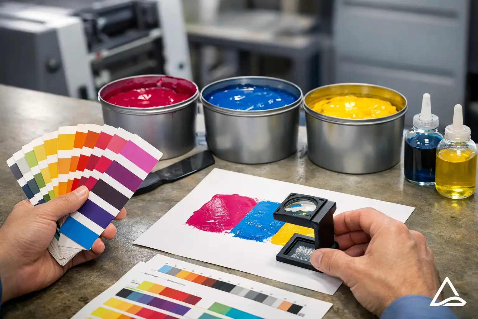
A royal blue that looks perfect on your laptop can print too purple on a cotton tee. A red that seems close enough in a digital proof can miss your brand standards once it hits the press. If you're figuring out how to match Pantone ink for your company apparel or promotional products, the goal is simple: get your brand color to print as consistently as the material and decoration method allow.
For business buyers in Salt Lake City and across the Wasatch Front, this matters more than most people expect. If your employee shirts, event giveaways, and staff uniforms all show slightly different versions of the same logo color, the finished set feels less polished. That does not always mean something was printed wrong. It usually means the material, ink type, and printing method were not accounted for early enough.
How to match Pantone ink without guesswork
The best place to start is with an actual Pantone color reference, not a screenshot, not a Word document, and not a color name like navy or forest green. Pantone numbers exist for a reason. They give your printer a specific target instead of leaving room for interpretation.
If your company already has brand guidelines, check whether they list coated and uncoated Pantone values. For most apparel decoration, your printer will use that Pantone number as a starting point, then adjust based on the garment color, fabric type, and ink system. If you do not have brand standards, it is worth choosing a Pantone color before ordering uniforms, trade show apparel, or promotional items for your team. It saves time and helps future orders stay consistent.
That said, matching Pantone ink is rarely as simple as calling out a number and expecting a perfect one-to-one result on every surface. Ink on paper behaves differently than ink on fabric. Thread behaves differently than ink. A stainless tumbler or tote bag can shift color again depending on the decoration process. The closer your expectations line up with the production method, the happier you will be with the final result.
Start with the right Pantone reference
A digital file is helpful for artwork, but it is not a reliable color-matching tool. Monitors vary. Phone screens vary even more. Two people in the same office can look at the same logo file and see different shades.
A printed Pantone book is still the best reference when exact brand color matters. If your marketing team is approving apparel for a corporate event, employee onboarding kits, or school staff shirts, that physical reference gives everyone the same point of comparison. It cuts down on vague feedback like "make it pop more" or "it looks a little off."
If you do not have access to a Pantone book, send your printer the Pantone number listed in your brand guide. If no guide exists, ask for help choosing the closest match based on your logo and intended use. Our team does this often for businesses that know their brand color visually but have never formally defined it.
Coated vs. uncoated matters
Pantone books usually show coated and uncoated versions of the same color. Those are not interchangeable. Coated values are intended for glossy surfaces and tend to appear brighter. Uncoated values look flatter and more absorbent.
For apparel, the printer is usually translating that Pantone target into an ink formula for fabric, not printing directly on coated paper stock. That means the Pantone number is a guide, but fabric and ink chemistry still affect the result.
The fabric and garment color change the outcome
This is where a lot of business buyers get surprised. A Pantone match on a white 100% cotton shirt is one thing. The same ink on a black polyester performance polo is another.
On light garments, ink colors usually appear cleaner and closer to the intended Pantone target. On dark garments, printers often need an underbase - usually white ink beneath the color - to help the top color show properly. That extra layer changes how the color sits and can slightly change the way it looks.
Fabric content matters too. Cotton, blends, and polyester all take ink differently. Some synthetic fabrics can also create dye migration, where the garment color subtly affects the printed ink over time if the wrong ink system is used. If your company is ordering uniforms for a field crew, athletic staff, or event team, that detail matters as much as the Pantone number itself.
This is one reason screen printing remains a strong choice when exact color matching is important. Spot color screen printing allows custom-mixed inks that can get very close to specific Pantone standards, especially for larger runs.
Decoration method affects how close the match can be
If you are ordering branded items for your company, you also need to match your expectations to the decoration method.
Screen printing
For screen printing, Pantone matching is the most straightforward. Ink can be mixed to a target formula, then tested on the chosen garment. If your order is for company shirts, event tees, or team apparel with a defined logo color, this is usually the best path when color accuracy matters most.
Even here, there are limits. A perfect Pantone match on paper may not be possible on every garment color or fabric. But among common apparel methods, screen printing gives the best control over spot color matching.
Embroidery
Embroidery does not use ink at all. It uses thread, and thread colors are selected from available stock ranges. That means embroidery is usually thread matched, not Pantone matched in the strict sense.
A good shop can choose thread that is very close to your brand standard, but it is still an approximation. Thread sheen, stitch direction, and fabric texture all affect perception. For polos, hats, jackets, and workwear, embroidery often looks more premium, but it is not the method to choose if an exact Pantone ink formula is your top priority.
DTF and DTG
DTF and DTG are useful for complex artwork, gradients, and smaller quantity needs, but color matching works differently than with custom-mixed spot inks. These methods rely on process printing, which builds color from combinations rather than mixing one dedicated Pantone ink for each color.
That does not make them bad options. It just means brand-critical colors may land close rather than exact. For some company projects, that is completely fine. For others, especially where brand standards are tightly managed across uniforms and promotional materials, screen printing may be the better fit.
Proofs help, but they are not the final color test
An art proof confirms placement, size, and general design direction. It is not always a precise predictor of the final printed color. That is especially true if the proof is viewed on screen.
When color is a major concern, ask specific questions before production starts. Is the color being mixed to a Pantone standard? Is the garment dark or light? Is the logo being screen printed, embroidered, DTF printed, or DTG printed? A few direct questions up front prevent a lot of frustration later.
For larger company orders or recurring programs, it also helps to keep production notes on the approved color, garment style, and decoration method. That way, if you reorder six months later for new employees or another event, your next run starts from an established reference instead of from scratch.
When an exact match matters - and when close is fine
Not every project needs the same level of color control. If you are printing employee uniforms, franchise apparel, school staff shirts, or branded trade show kits, consistency usually matters a lot. That is where specifying Pantone targets and choosing the right print method pays off.
If you are ordering event shirts for a charity run, volunteer apparel, or giveaway items where timing and budget matter more than exact shade precision, a close visual match may be enough. The right choice depends on how the item will be used and who will see it.
That is the practical side of how to match Pantone ink: treat color as part of production planning, not an afterthought. The earlier your team defines the target color and the intended decoration method, the smoother the job goes.
For businesses in South Jordan, Salt Lake City, and surrounding Utah communities, we help sort through these details every day. If your team needs screen printing, embroidery, DTF, or DTG and you want the closest possible match to your brand colors, we can walk through the best option for the garments or promo items you are ordering. Standard turnaround is 12 business days from artwork approval, and rush orders are available when timing is tight.
If you are planning branded apparel or promotional products for your company, request a free quote at affordable-printing.com/request-a-quote/ or call (801) 260-0606. A quick conversation now can save your team a reprint later.
Ready to start your order?
GET A FREE QUOTE