_1782777776334-CjnZ693B.png)
June 25, 2026
Artwork Setup for Screen Printing Basics
A screen print job can go sideways before a shirt ever hits the press. Most delays happen at the artwork stage - blurry files, too many colors, tiny details that will not hold on fabric, or logos pulled from a website instead of the original design file. If your company is ordering apparel for a staff rollout, trade show, fundraiser, or company event in Salt Lake City, solid artwork setup for screen printing saves time, protects your brand, and keeps production moving.
For business buyers, the goal is not to become a print designer. The goal is to send artwork that prints cleanly, matches your brand as closely as possible, and does not create avoidable revisions. Our team helps with that every day, but it helps to know what screen printers are looking for before you send files over.
What artwork setup for screen printing actually means
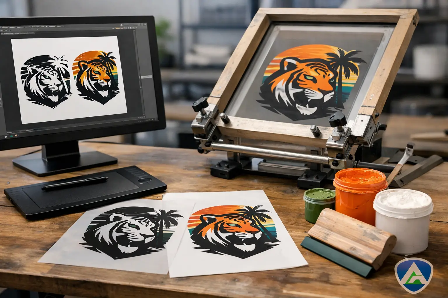
Artwork setup for screen printing is the process of preparing a design so it can be separated, burned to screens, and printed accurately on garments. That includes file format, sizing, color choices, line thickness, and how the art interacts with the shirt color.
Screen printing is not the same as posting a graphic online or placing a logo in a slide deck. A design that looks fine on a laptop may not print well on cotton, fleece, or performance apparel. Ink behaves differently than pixels. Fabric texture matters. Garment color matters. The number of print colors matters too.
That is why print-ready artwork is usually simpler and more intentional than digital artwork. Clean edges, solid color areas, and readable text tend to perform better than effects-heavy files with glows, shadows, gradients, or very fine detail.
Start with the right file type
The best artwork files for screen printing are vector files. These usually come as AI, EPS, or sometimes a print-ready PDF built from vector art. Vector files can be resized without losing quality, and they separate much more cleanly for production.
Raster files like JPG, PNG, and PSD can still be usable, but it depends on quality. A high-resolution file may be enough for a straightforward design. A logo copied from a website usually is not. If the art gets pixelated when enlarged, it will not improve on press.
A common issue for companies is that the only logo available is the one from an email signature, social media page, or website header. That file may look acceptable on screen, but it is often too small or compressed for apparel printing. If your marketing team or designer has the original brand files, send those first.
If you do not have vector art, a printer may be able to recreate or clean up the design. That is normal, especially for older logos or community event graphics. It just adds a step, and sometimes that step affects timeline.
Vector vs. raster in plain terms
If your logo needs to go on polos, T-shirts, hoodies, and promo items in different sizes, vector is the safer choice. If your design is a full-color illustration or photo-based graphic, raster may be part of the process, but it still needs enough resolution to print well.
For most company logos, school marks, sponsor graphics, and event branding, vector art is the standard starting point.
Color setup matters more than most buyers expect
One of the biggest misunderstandings in artwork setup for screen printing is color. On a monitor, a design can use hundreds of blended colors. In screen printing, each ink color is usually printed separately. More colors often mean more setup and more cost.
That does not mean your art has to be boring. It means colors should be chosen intentionally. If your logo has a blue, a gray, and a white version, it helps to know which one should print on navy shirts versus ash shirts versus black hoodies. A good file is only part of the job. Good direction matters too.
Pantone matching is often the best route when brand consistency matters. For company apparel, franchise programs, school branding, or sponsor-driven event merch, exact color matters more than it does for a casual reunion shirt. If your team has Pantone colors, provide them. If not, a printer can usually help get close based on your brand standards.
Light garments and dark garments are different jobs
Artwork that works on a white tee may need adjustment for a black hoodie. On dark garments, many prints need an underbase so the colors stay bright. That can affect how the art is separated and how fine details reproduce.
This is where simple designs often win. Thin outlines, small text, and subtle shading can get lost when layers of ink are involved. For staff uniforms, event shirts, and company giveaway apparel, bold usually prints better than delicate.
Size the design for the garment, not the screen
A logo on a left chest and a graphic on the full front are two different applications. The art should be set up with the final print size in mind, not just sent over as a random file with no dimensions.
For example, a left chest print is usually much smaller than a full front design. If the logo includes tiny tagline text, it may be readable on a website and completely unreadable at embroidery or small-print size. The same logo might work perfectly as a large back print.
That is why placement matters during setup. When your company requests a quote, it helps to specify whether the design is for left chest, sleeve, full front, full back, or multiple locations. If you are ordering for your employees, sales team, or event staff, think about how the garment will actually be used. A clean left chest logo may be right for uniforms. A larger graphic may be better for a promotional event shirt.
Fine detail is where problems show up
Screen printing holds detail well, but not every detail. Very thin lines, tiny text, distressed textures, and layered transparency effects can create production issues. What looks sharp at 800 percent zoom may fill in or break apart on fabric.
A good rule is that the more practical the garment use, the cleaner the artwork should be. Work shirts, volunteer tees, school staff apparel, and corporate event pieces usually benefit from stronger shapes and clearer lettering. That is not a limitation. It is how you get a design that reads from across the room and still looks good after repeated wear.
If your artwork includes small legal copy, sponsor lines, or department names, ask whether those elements will hold at the intended size. Sometimes the fix is simple - enlarge the print, remove a line of text, or separate one crowded graphic into front and back placements.
Backgrounds, transparency, and special effects
Designers often send files with drop shadows, gradients, faded edges, or transparent effects because they look polished digitally. Sometimes those can be converted for screen printing. Sometimes they cannot, at least not without changing the design or increasing the color count.
This is one of those it-depends areas. A simulated process print can reproduce complex artwork, but that is a different setup than a simple spot-color logo print. If your goal is budget-conscious company apparel with clean branding, spot colors are usually the better fit. If your goal is a more detailed event graphic, there may be other options, including DTF or DTG depending on the art and quantity.
That is why method matters. Screen printing is excellent for bold, repeatable designs and larger runs. For smaller quantities, highly detailed artwork, or full-color images, another decoration method may make more sense. A good shop should tell you that directly.
Approval is not just a formality
Once artwork is cleaned up and sized, you will usually receive a proof. This is the point where your team should verify spelling, colors, placement, and garment selection. Do not treat approval like a quick checkbox.
If the wrong department name, event date, or shirt color gets approved, production will follow the proof. For business orders with multiple decision-makers, it helps to have one person responsible for final signoff. That keeps projects moving and avoids crossed wires.
Our standard turnaround is 12 business days from artwork approval, and we often finish sooner. That means artwork delays early in the process can affect the whole order, especially for event deadlines, staff onboarding, or trade show schedules.
The easiest way to keep your order moving
If you want fewer revisions, send the highest-quality logo file you have, include any brand colors, note the print locations, and mention what the garments are for. A polo program for your office staff in South Jordan may need a different setup than T-shirts for a nonprofit fundraiser or hoodies for a construction crew on the Wasatch Front.
Also mention if you are comparing decoration methods. Screen printing, embroidery, DTF, and DTG each handle artwork a little differently. The best choice depends on fabric, quantity, budget, and how detailed the design is. For most group orders, that early conversation saves time.
Good artwork setup does not need to be complicated, but it does need to be intentional. If your company has a logo and a deadline, we can help you sort out what will print well, what needs adjustment, and what method makes the most sense for your team. To get a free quote, call (801) 260-0606 or visit affordable-printing.com/request-a-quote/.
Ready to start your order?
GET A FREE QUOTE